I’m a product designer on integrity experiences at Meta, trying to make our apps safer and more inclusive.
Since joining Meta in 2016 I’ve helped build dozens of new teams, products and experiences across different areas, in addition to growing design through coaching, training and recruitment.
Meta Integrity Experiences
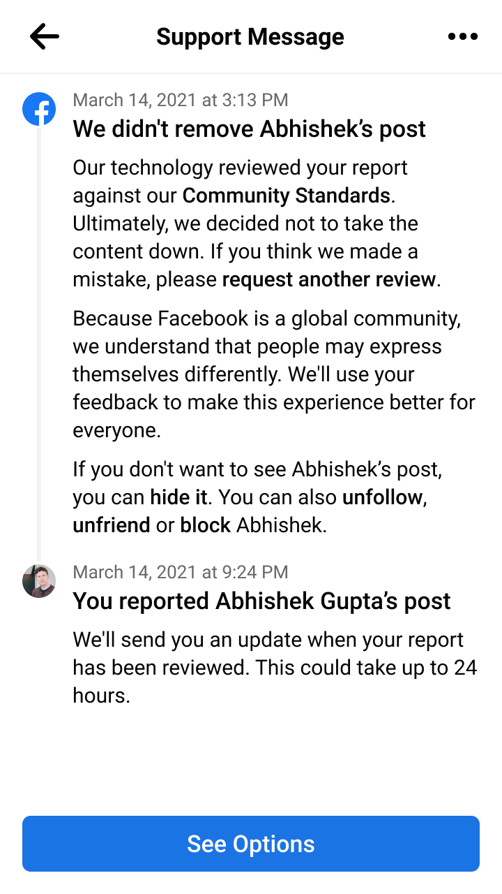
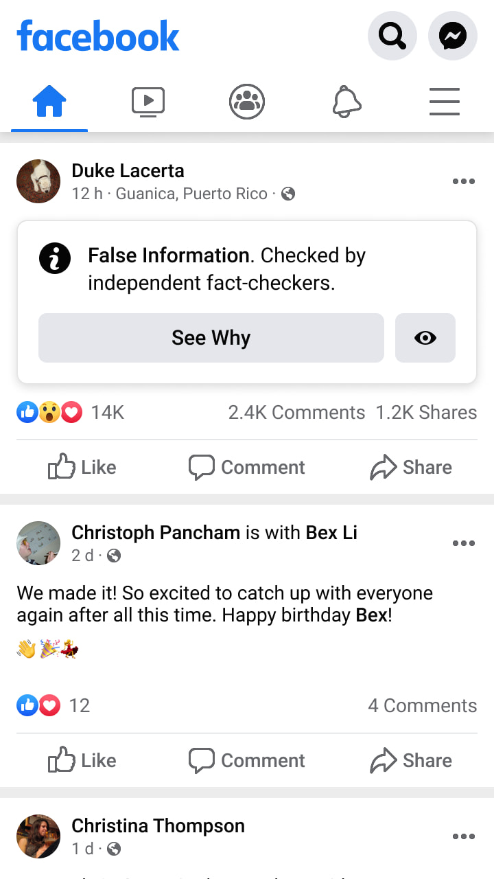
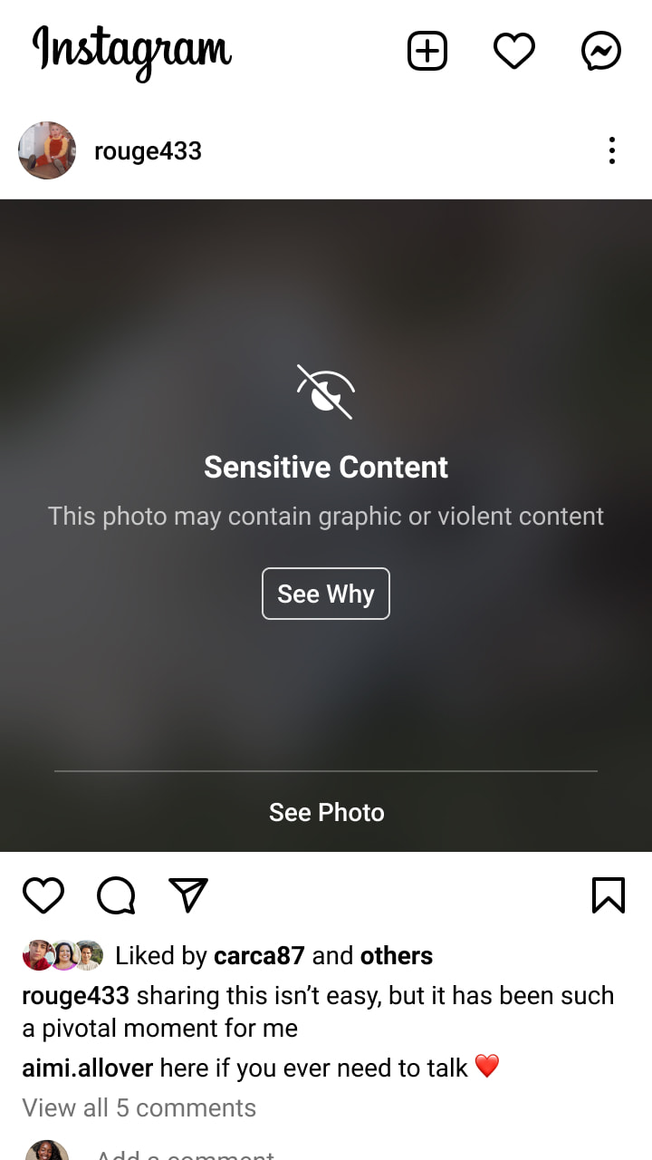
2019–PresentI currently work across Facebook, Instagram, Messenger and WhatsApp on problems like objectionable and borderline content, misinformation, violence and criminal behaviour, privacy and authenticity.
This involves building products that support people through bad situations, experiences that proactively inform and educate people, and interventions that prevent harmful content from reaching wider audiences.
Integrity work involves endless tradeoffs and rarely any ‘right’ answers. Our experiences have to be effective across the spectrum of digital literacy, provide detailed transparency into what has happened, why and what people can do – while also staying as consistent as possible across the apps.
Workplace from Meta
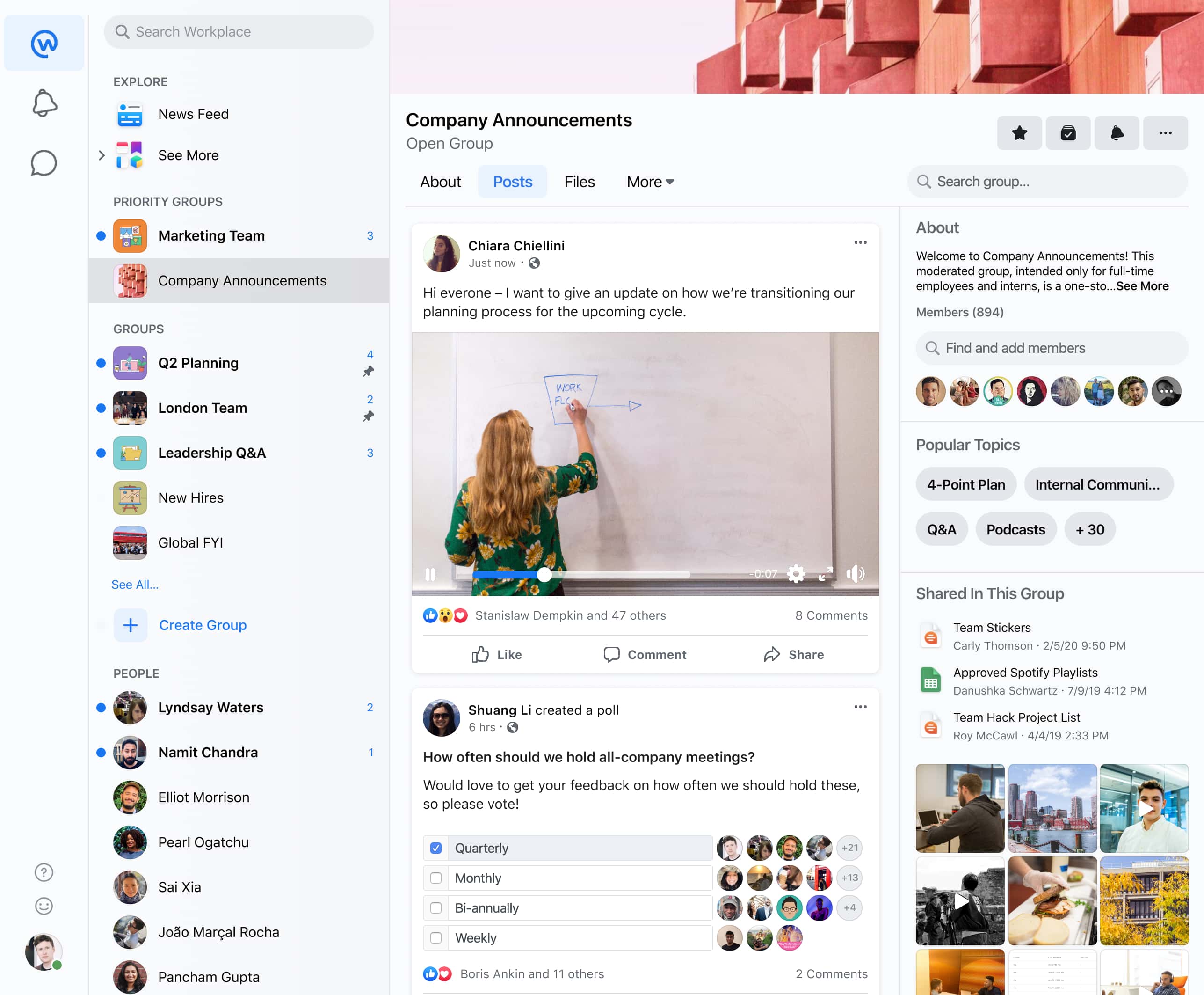
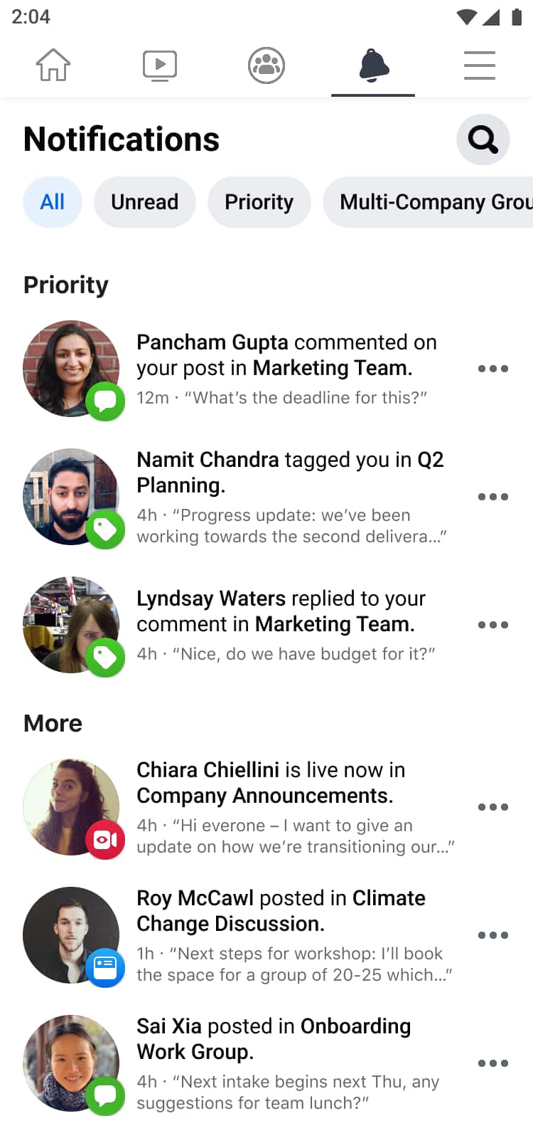
2018–2019Workplace started life as an internal project, but has grown into a communication platform more than 30,000 organizations worldwide depend on to stay connected via Groups, Chat, Video Calls, Live video and more.
During my time on Workplace I helped form the landing team for our first acquisition in 2018, was part of the major product redesign that launched in 2019, and drove a series of new product changes to help people manage their most important content.
Facebook Travel Experiences
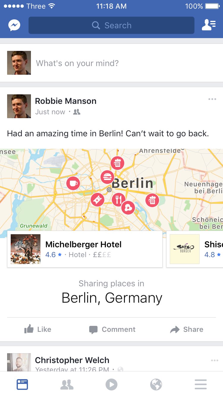
2017–2018I co-founded and led the design of a new team at Facebook called Travel Experiences, the first team at Facebook to focus solely on travel products.
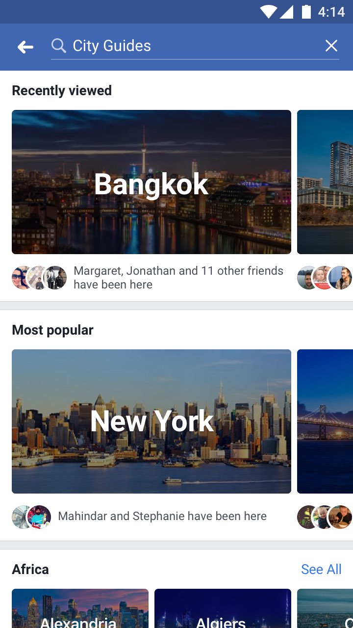
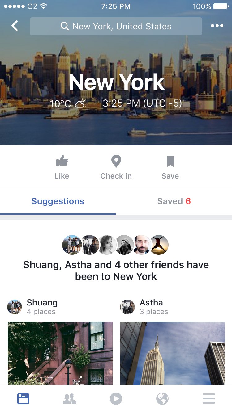
The team started as a side project, with City Guides – pages for thousands of cities showing you which kinds of places your friends have been in each city, where the locals go, popular attractions, and more.
We evolved City Guides and built a number of other experiences around travel sharing and planning, leading us to become the largest mobile travel product in the world within a year of creating the team.
Facebook Local Ads Solutions
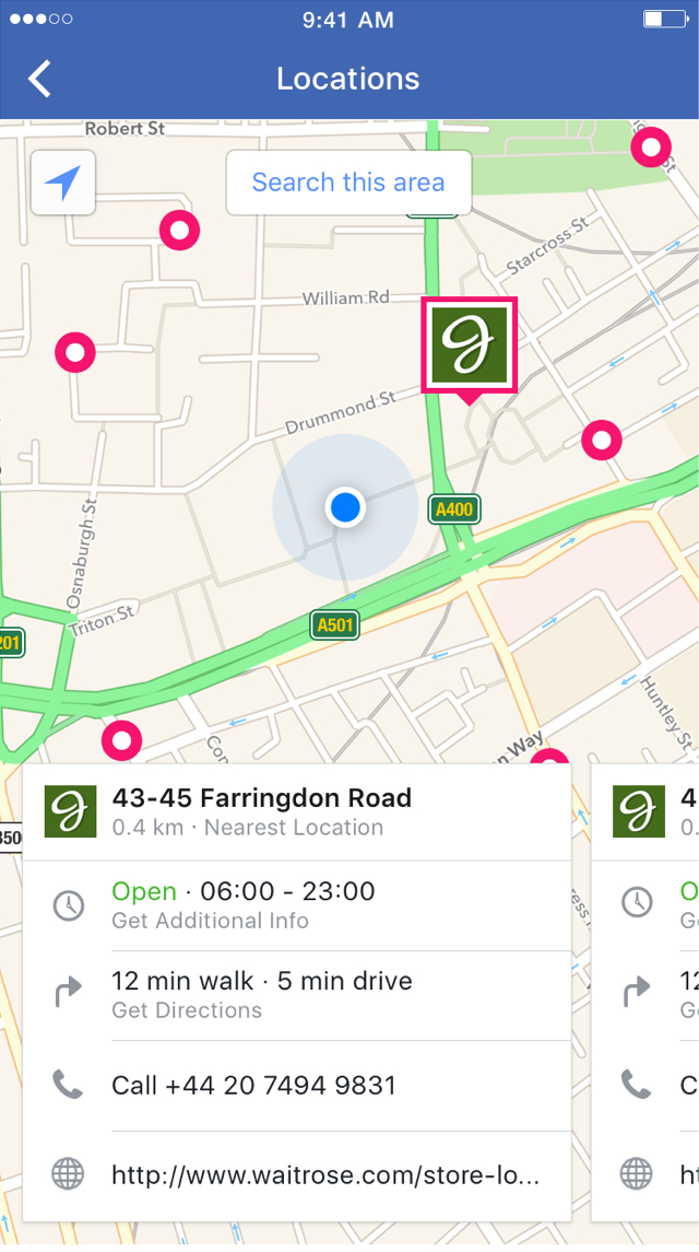
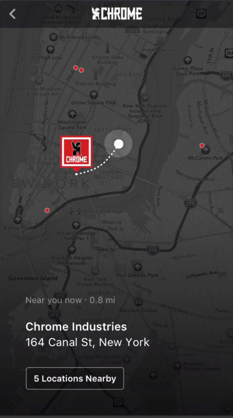
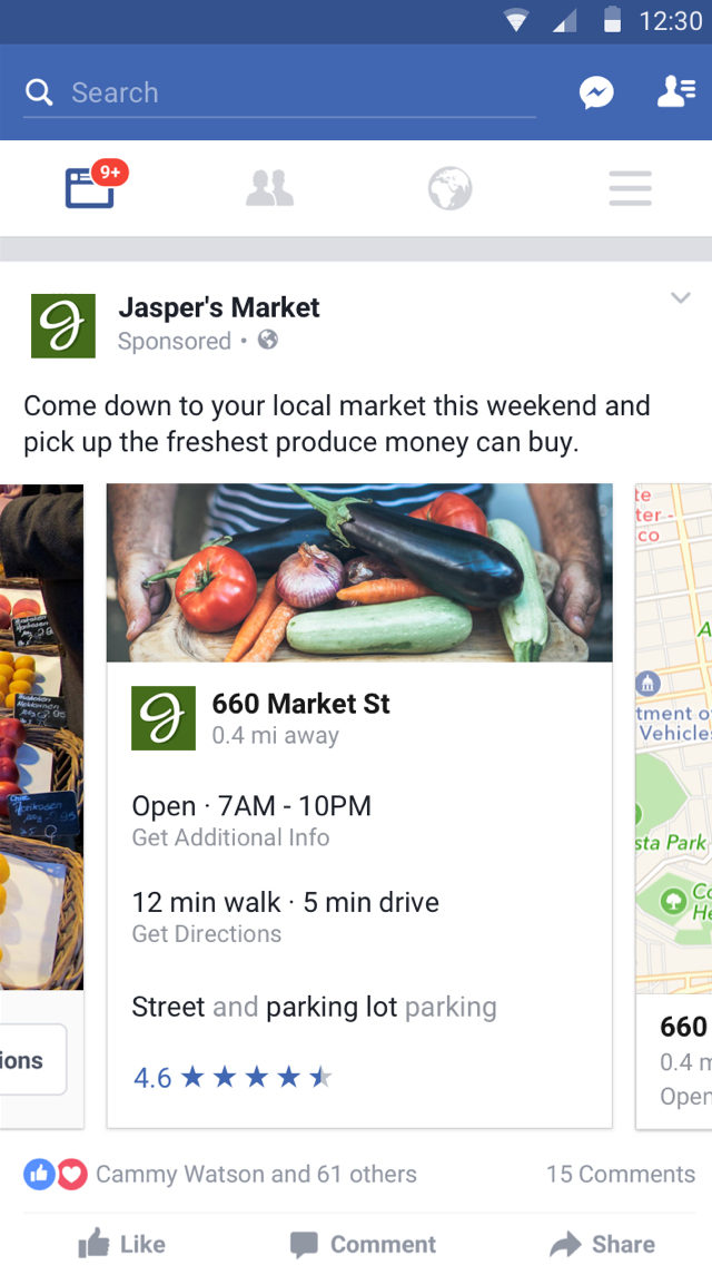
2016My first role at Facebook involved creating new tools and News Feed formats for local, high-street business owners.
Our audience was primarily small to medium-sized business owners with little time to spend on promotion, so our focus was on building lightweight creation tools that helped differenitate them from larger competitors.
FreeAgent Mobile
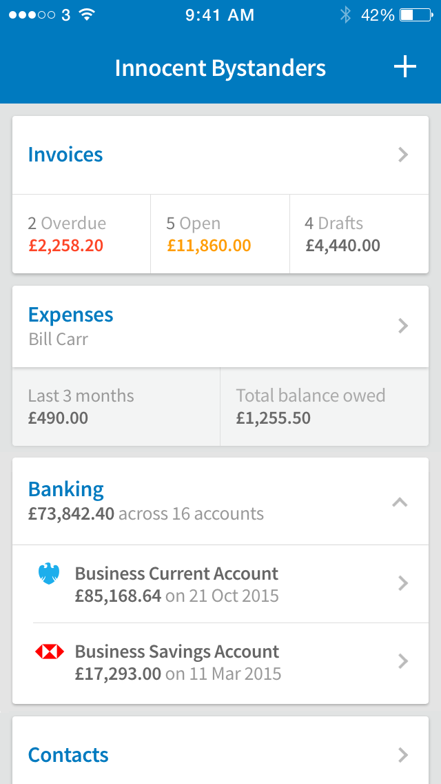
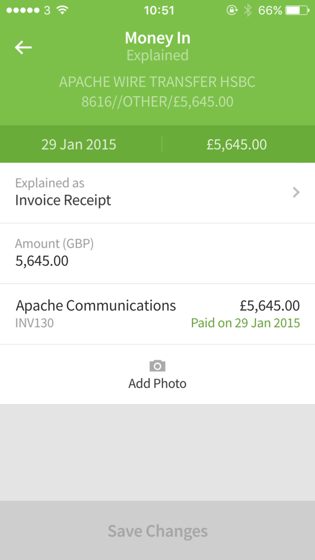
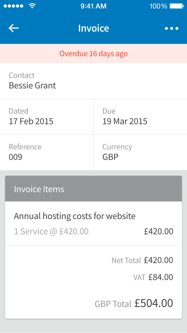
2014–2015I was the design lead on FreeAgent’s first native iOS app from the start, taking it from research and planning, through visual design and prototyping, building out the HTML & CSS front-end, and working with engineers to implement.
During the project I built and open-sourced our CSS utility library, and later our internal CSS framework Origin, which consumed and now powers many other projects and codebases.
The app was a web/native hybrid, allowing us to maintain largely the same codebase while pushing out new features across iOS, Android, and eventually web versions at the same time.
Project Dashboards
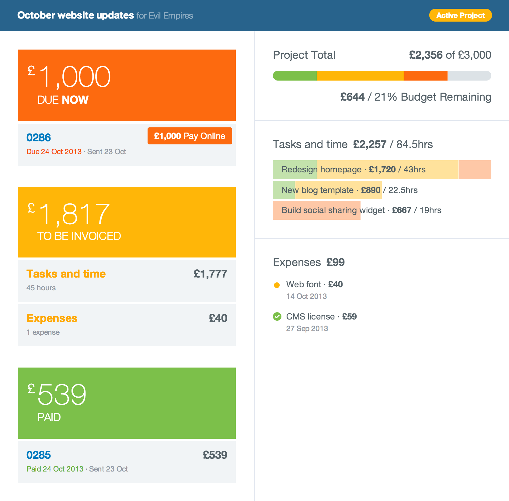
2014I conceived, researched, designed, and built the prototype for Project Dashboards — allowing FreeAgent customers to share the status of projects with their clients: budget remaining, task statuses, balance owed, expenses logged, and more.
They’re intended to provide a quick way to passively check-in on the time and money aspects of a project, negating the need for manually written status updates. They also give clients the ability to pay outstanding invoices online.
All dashboard information is derived from projects already in FreeAgent, so there’s no extra work involved for customers. They simply share the dashboard link with their client, and the client can stay up to date wherever they are on whatever device they might have.
FreeAgent Mobile Web
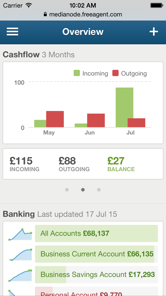
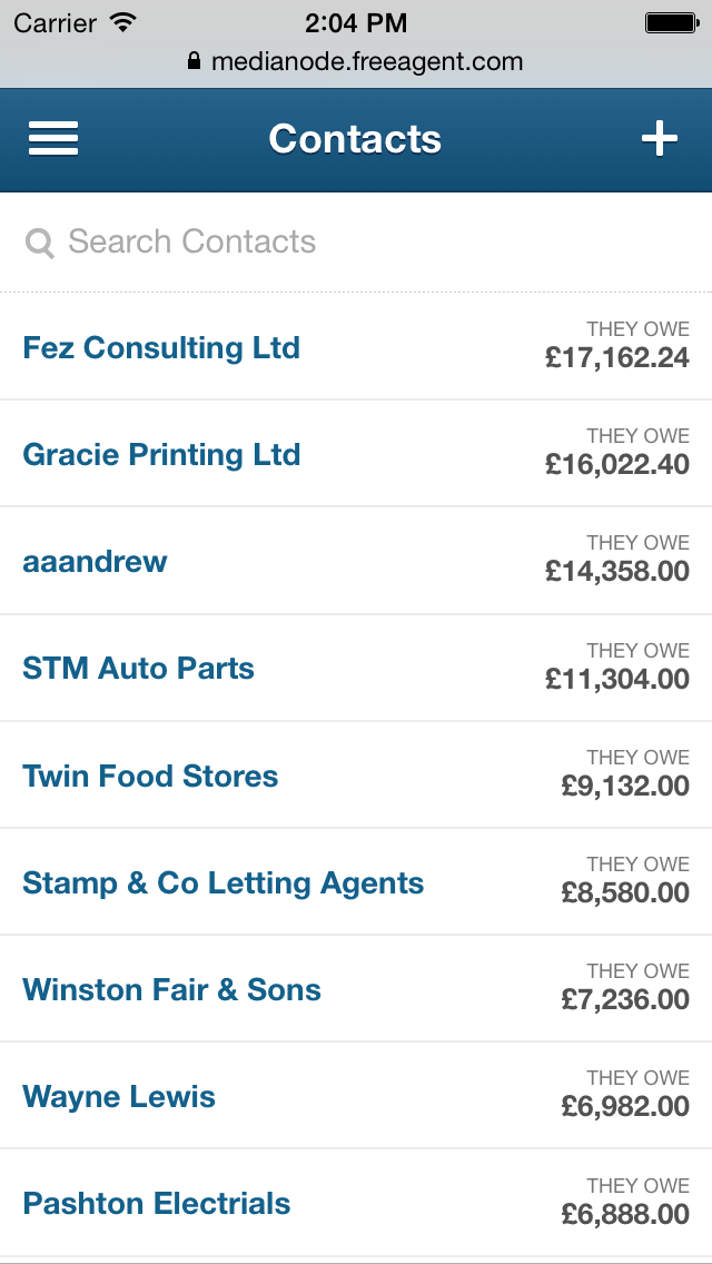
2012I designed and built out the front-end for the mobile web companion to FreeAgent’s ‘desktop’ app. Having started out as a Hack Days project for a few of us frustrated with (the lack of) FreeAgent mobile offering.
Two particular constraints made this project interesting: there had to be a strong likeness to the desktop app to make switching seamless, and it had to work well on budget Android handsets and Windows Phone.
Though not without its faults, we chose to detect the user agent of devices and serve up mobile-specific views instead of ‘mobile optimised’ versions of the desktop views. I also opted to build the front-end from scratch rather than using a framework, so things remained as light and nimble as possible.
Earnest
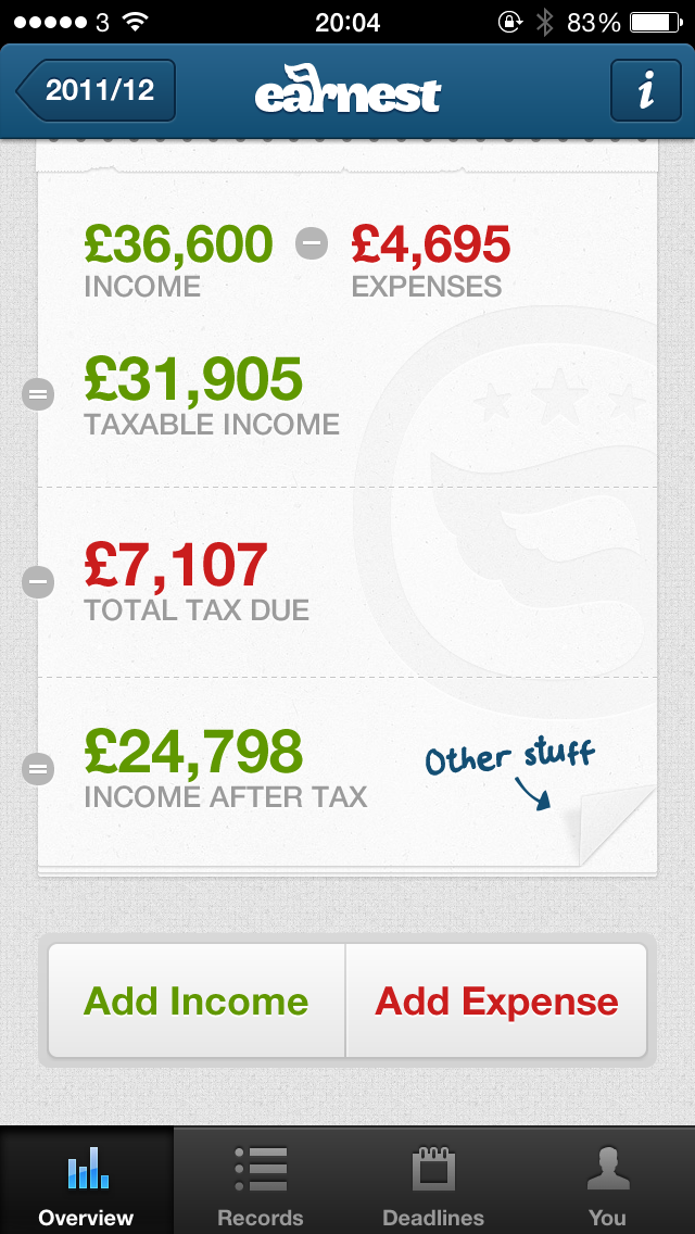
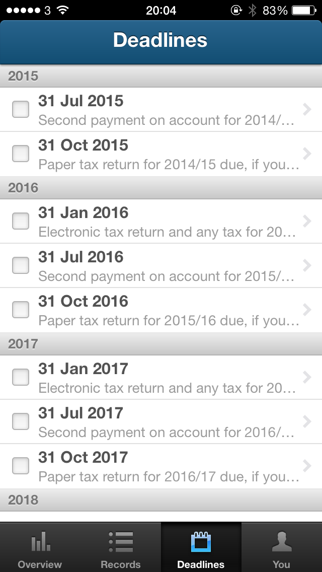
2012Earnest was my very first foray into native iOS design — an iPhone app to help self-employed people keep track of their income, expenses, and tax owed. I designed the UI, logo, and other brand assets.
The intention was to counter typically dull, utilitarian record-keeping software with something slightly more playful and fun. There also had to also be some visual and behavioural consistency with FreeAgent, Earnest’s “big sister”, to ease the transition people might make when ‘graduating’ to FreeAgent.
Earnest won ‘Best Mobile Application’ at the 2012 Scottish Digital Business Awards.
FreeAgent redesign
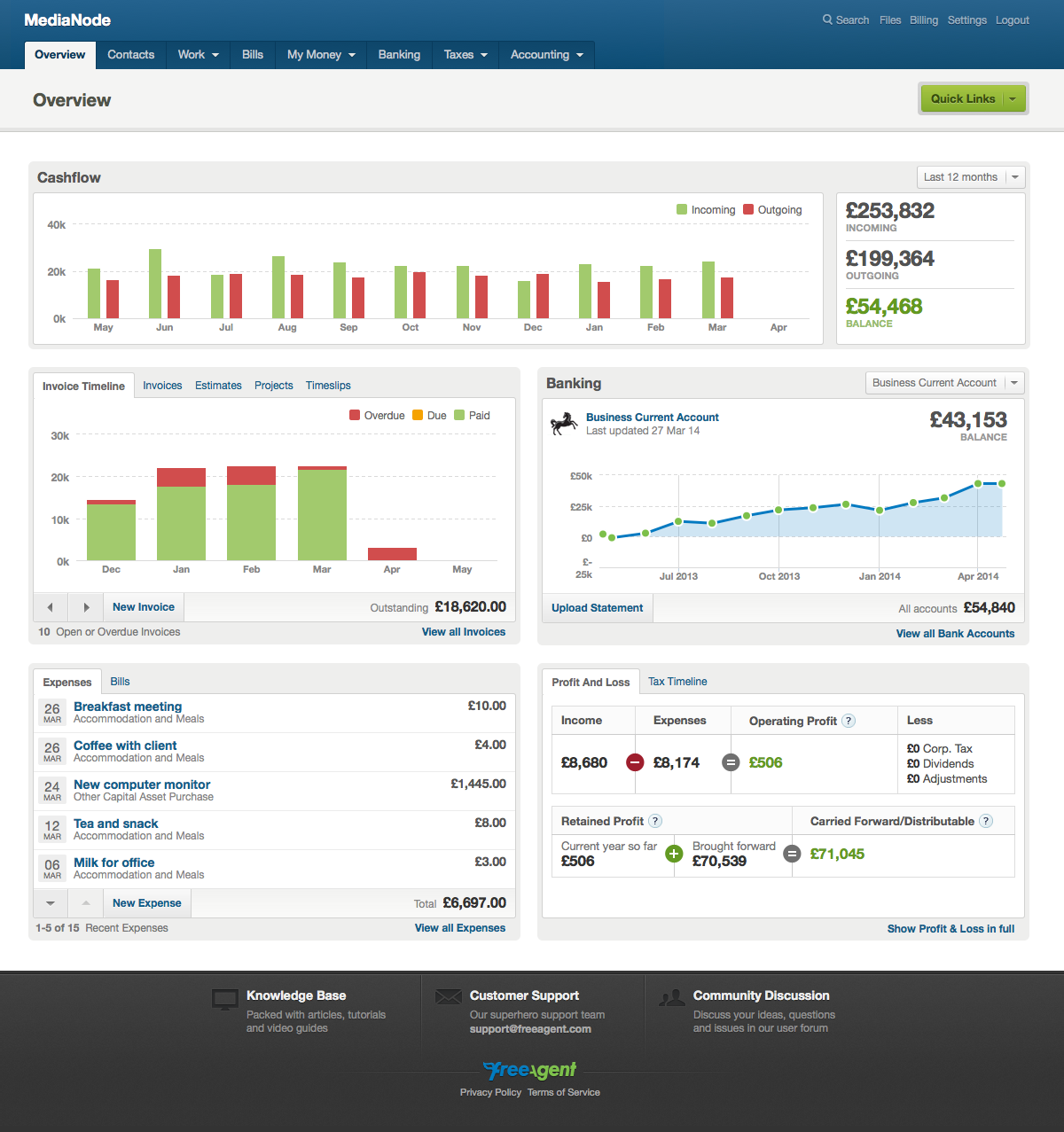
2011/2012One of my earliest projects at FreeAgent was to redesign our then 4 year-old ‘desktop’ app, relied upon daily by tens of thousands of people to run their businesses. No pressure! Customer pain points were clear; support tickets, public forums, and private conversations had all helped inform what needed to be done.
A reimagined overview screen allowed customers to see their cashflow, customise their layout, and quickly switch to specific sections. Navigation was redesigned, and a new sidebar component added to display rich metadata about the current view. Countless other visual and functional changes were made.
After bringing customers in-house for usability testing sessions, we extensively beta tested the redesigned app for months to help refine our ideas and execution before succesfully launching in June 2012.
The redesigned app has played a key role in sustaining the growth of the product and customer base. It also taught us invaluable lessons about scope creep, strict refactors, and avoiding ‘big bang’ launches.
BuildBoard
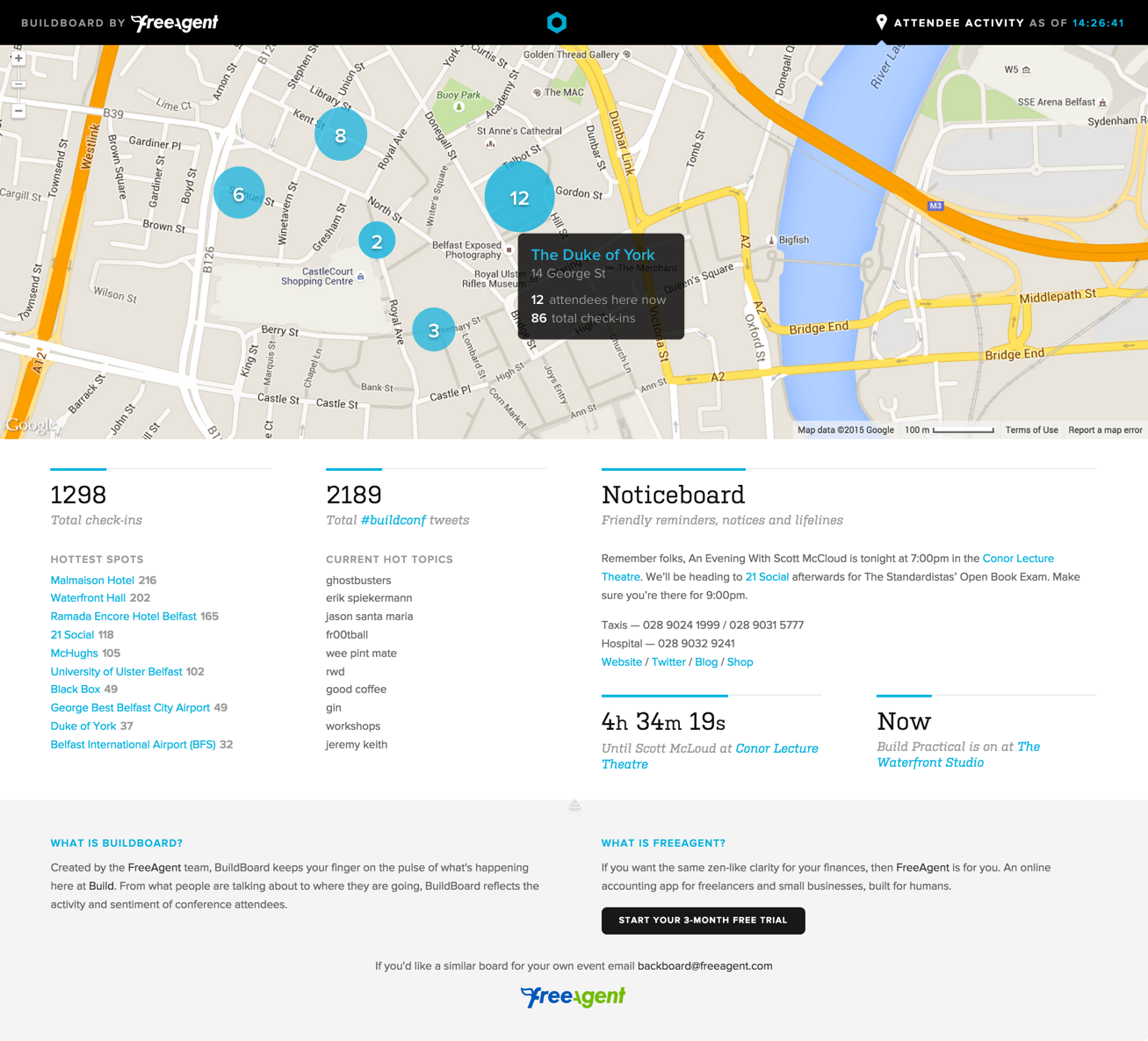
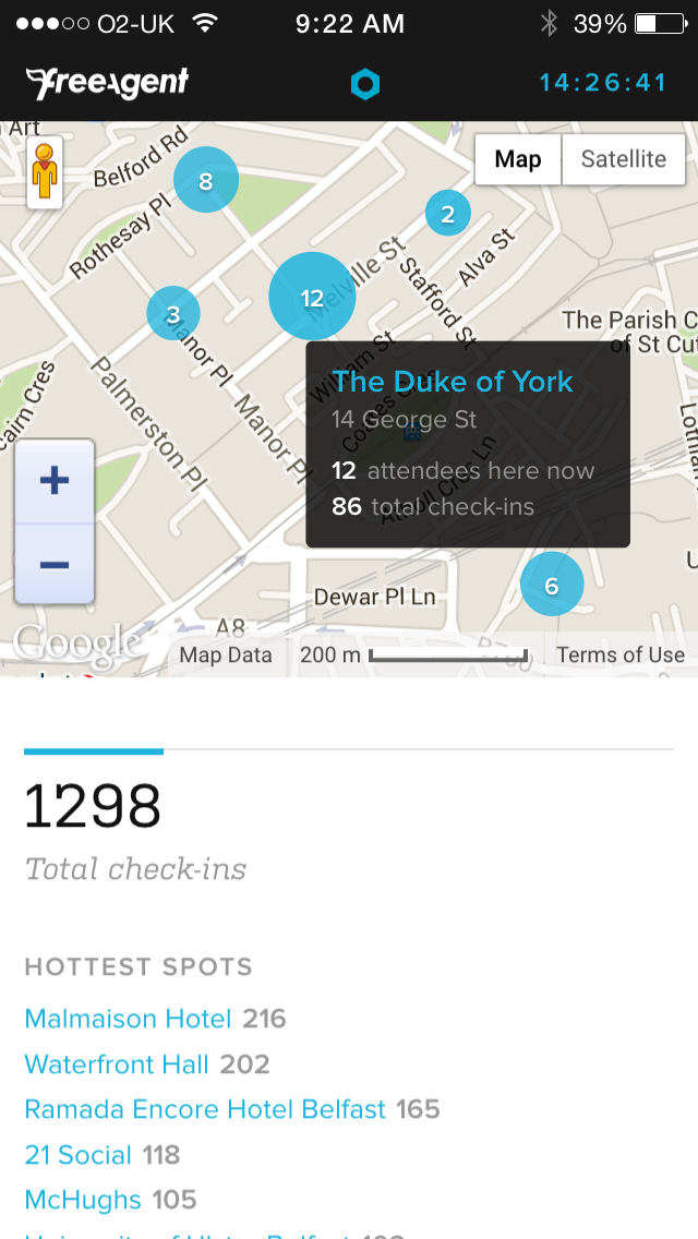
2011BuildBoard was an experimental project for Build, created as a way to track attendee activity and sentiment. I designed and built its mobile-first responsive layout, based on Kyle Meyer's Build site design.
Made as part of a collaboration between FreeAgent and developer James Newbery, we mapped out Foursquare check-ins so attendees would know where other Build folks were, and combed #buildconf tweets for ‘hot topics’.
We also built an event countdown tied to events throughout the week, and an admin area allowing conference organiser Andy to update attendees with any timely information.
FreeAgent Depot
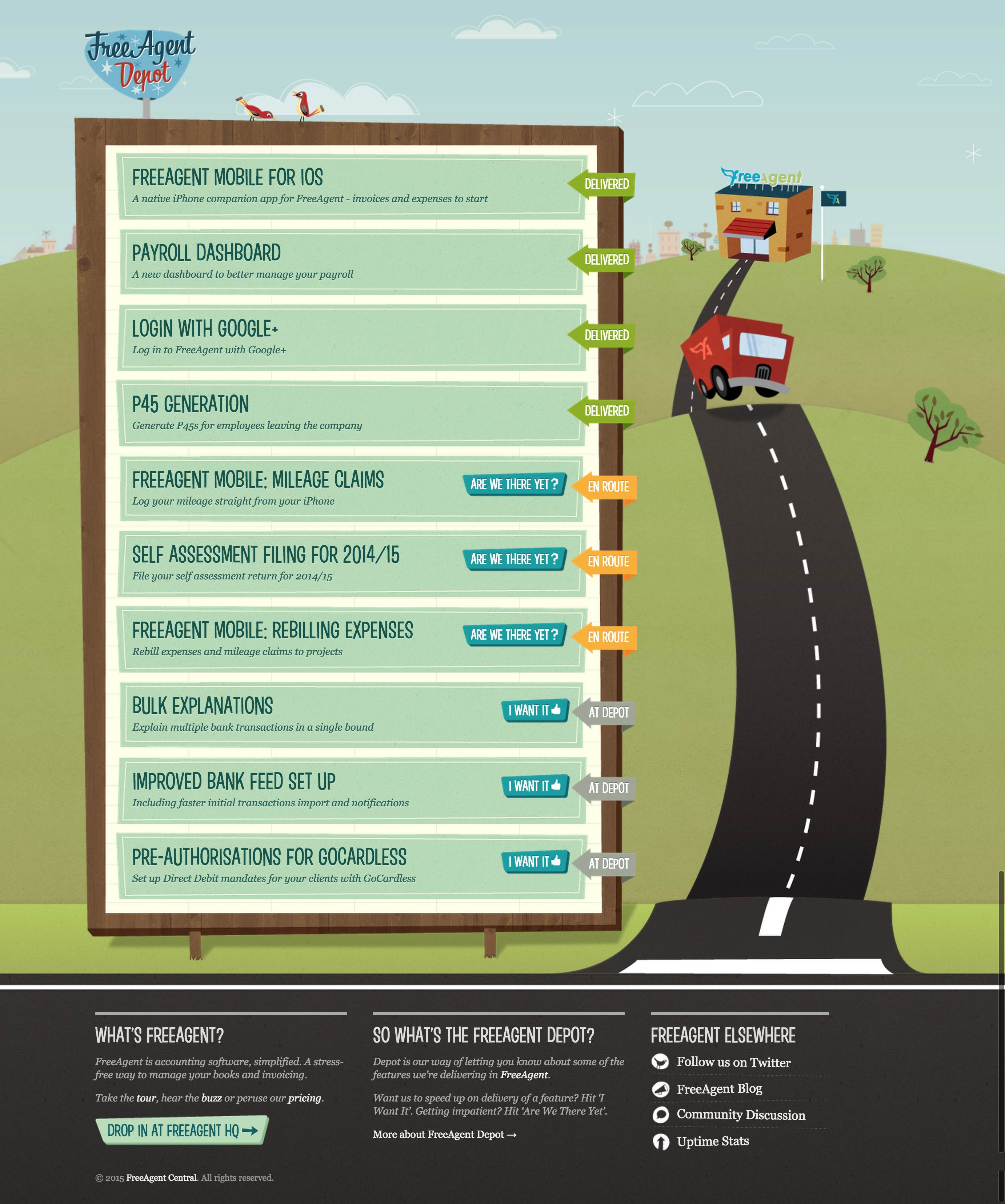
2010The Depot provides FreeAgent users with a snapshot of what features are currently in development, and allows them to vote for the features they want the most. I designed and illustrated it, along with building the front-end.
The challenge of creating The Depot was how to make something like a public product roadmap (already contentious, even dangerous), without setting unrealistic expectations for customers. Customers could have their say, but on things we’d already agreed as an organisation to focus on.
The illustrative approach was intended to make it feel distinctly different from the FreeAgent app; it should be a different headspace altogether.

Logos
Designing marks and logotypes is something I’ve kept up over the years, despite not taking on much freelance work. I really enjoy the challenge of translating an organisation’s ideas or values into a simple visual form, then figuring out how to use that in a whole brand identity system.
