John & Ro’s wedding invites
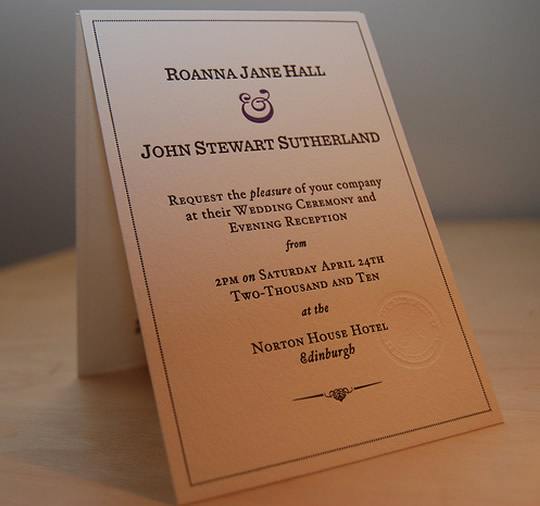
I don’t claim to be any kind of print designer. I occasionally do bits and bobs for friends, but rarely anything of merit. But when my friend John asked me if I’d be interested in designing wedding invitations for him and his wife-to-be Ro, I knew it’d be a great opportunity to contribute something personal to their wedding arrangements.
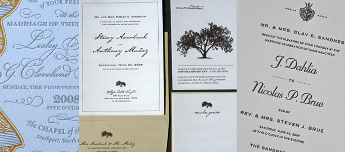
To get a feel for the kind of result John and Ro were looking for, we sat down to look at a load of wedding stationary examples I’d collected. John already knew he wanted the invites letterpressed, but to my surprise, neither John nor Ro wanted to use script typefaces. I was secretly pleased, as unless scripts are handled brilliantly well, they can often result in wedding invites looking a bit clichéd. They didn’t want anything too elaborate either; nothing too fancy or ornate. Something simple, elegant and classical, but with a modern twist.
Establishing a style
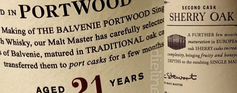
John is a big whisky fan, so I began looking at whisky packaging for initial inspiration. Whilst the sheer amount and variety of packaging was staggering, I was left a bit disappointed. Occasionally, there were lovely combinations of typefaces and some beautifully articulate design elements, but none of it was near what I had in my head. Then, as luck would have it, I stumbled across The Dieline’s article on the revamped Balvenie packaging. I loved the hand-carved elements, reserved colour palette and multiple different treatments of type. John and Ro did too, so we had our starting point.
Getting the type right
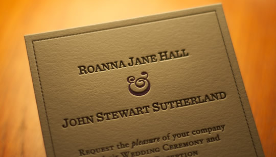
Type was always going to be the driving force behind the invite, and the process of finding the right faces took a while. We eventually paired it down to Hoefler and Frere-Jones’ Sentinel for headlines and Hoefler Text for body copy. As a modern rendition of the classic Clarendon, Sentinel fitted the bill for classic-with-a-modern-twist. There isn’t currently a small-caps variant, so I had to fake one myself. Not ideal, but an exercise in itself! The enormity and range of the Hoefler Text family is incredible, but the elegance of Hoefler Text Italic Swash was the real deal maker. Using italics to emphasise particular words in the body copy would not only serve a functional purpose, but would add some variation and create more of a hand-crafted feel.
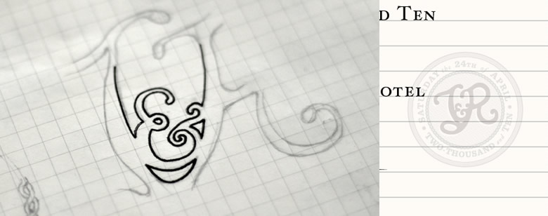
The ampersand was to be an important element, tying the two names together but also acting as a decorative feature and providing the only colour on the invite. My initial choice was from the italic variant of Caslon; an elegant—if somewhat overused—ampersand. It was only shortly before going to print that I happened upon Haäfe & Haph’s incredible collection of ten ampersands. At $9.99, it was a no-brainer purchase, and ’Swirlium’ felt like a great fit for what we already in place. Purple was chosen to match the colour of the bridesmaid’s dresses, creating a little more continuity with the wedding itself.
Creating the crest
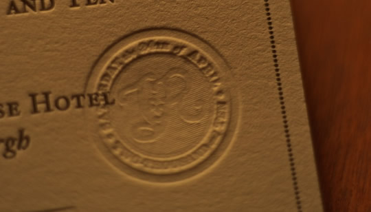
The Balvenie packaging features a lovely blind-embossed crest, and it provided the catalyst for the creation of a crest for John and Ro. Though the extra printing cost was considerable, it was an opportunity for me to create an element by hand that would mark the event; something they’d always have to remind them of the day — or at least the laborious invite process!
The results
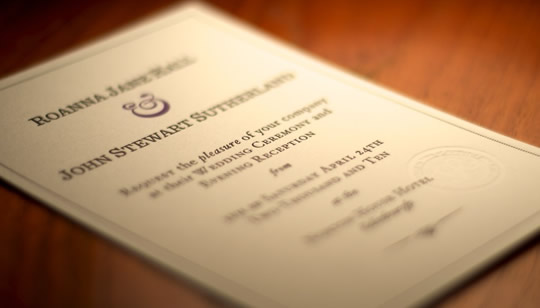
We were all pretty thrilled with how the invites turned out. If you’re looking for a friendly, helpful and professional letterpress printer, Studio On Fire come highly recommended. Working on the web almost exclusively now, it’s so nice to design something as tactile as this. If you get the opportunity to have something letterpressed, don’t pass it up!
