FreeAgent Mobile
2014–2015I led the design of FreeAgent’s native mobile apps, giving customers a faster and more convenient way to manage their day-to-day business finances.
I led the design of FreeAgent’s native mobile apps, giving customers a faster and more convenient way to manage their day-to-day business finances.
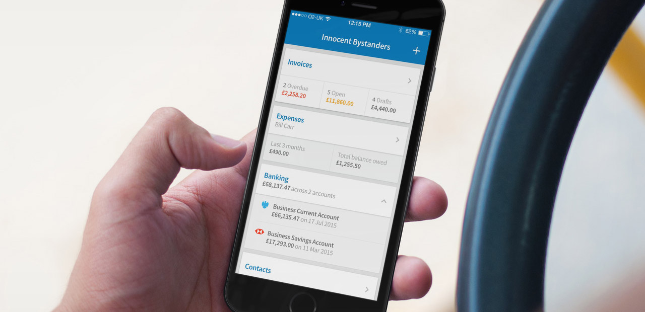
All interface design, prototyping, HTML & CSS, and IA. Contributer to strategy, planning, and testing.
This is one of the longest and most rewarding projects I’ve been a part of. Involving a small core team, resulting in two open-source projects, helping to push forward our design language, and somehow making it work with an 11-hour time difference.
When we built the initial ‘mobile web’ version of FreeAgent back in 2012, we did so with the assumption that our mobile traffic was going to increase over time. But by early 2014 that increase was ten-fold. It was time to define a larger mobile strategy. We wanted to combine the data we already had with a deeper understanding of how our customers were using FreeAgent on their phones, what their feelings were, and what opportunities an app store distribution channel might give us.
With the desktop app being so broad (around 18 areas of functionality for the most complex company/account types), what should the mobile app actually focus on? How could we make the most of opportunities unique to mobile rather than just reproducing existing functionality and behaviour?
Around this time I moved to Melbourne, Australia to work remotely for a year (which I’m writing a whole other post about). While I was conducting user research on a completely different project, my colleague Andy lead a series of interviews with UK customers, finding out about how they worked, when and where they did their accounting, their attitudes towards finance and accounting, particular day-to-day FreeAgent workflows, how (if at all) they measured the health of their businesses, and what their existing mobile usage of FreeAgent was.
Of all the insights our research highlighted, one theme in particular stood out to me: people accepted it wasn’t really possible to manage their business finances from your phone. Most people were resigned to sitting on their computer at home to take care of that stuff.
Our existing mobile web version clearly suffered from a lack of visibility. But even among those using it, the fact it wasn’t an app that “lived” on their phones meant it didn’t feel as legitimate or capable. People didn’t have the same sense of connection as they did with native apps.
We knew a visible mobile offering could be influential in determining the power and reliability of a product, and justifying its cost. But the research highlighted just how influential, across all manner of business types and sizes. We couldn’t afford not to improve.
It felt like there was an opportunity to make mobile a key way to ‘hand off’ incomplete tasks. Starting a task on mobile (like taking a photo of an expense receipt) then finishing it up later on a tablet or desktop machine would clearly help save time in the long run.
Customers relied hugely on having quick access to their top-line figures in the ‘Overview’ view on FreeAgent desktop. That view was critical in allowing them to gauge their business health, and providing the most important at-a-glance figures on mobile felt essential.
More and more people were considering their smartphones the primary computing tools in their businesses. We wanted to consider the implications of that, and design for a future where all of their day-to-day business finances could happen on the phone.
We decided to focus the app completely on day-to-day tasks. No analysing cashflow, checking profit and loss reports, or submitting your annual tax return. Instead just concentrating on invoices, expenses, contacts, and banking. We wanted people to use the ‘in-between spaces’ during travel, on a coffee break, or at home outside of office hours to take care of the little things that inevitably always added up to more time at their desk.
We always want to encourage better habits in customers. But there’s also a wider market challenge just to get people more engaged and confident in their business finances. Mobile devices are the perfect vehicle for making good on both. Nailing day-to-day tasks on mobile should give people a greater sense of control and confidence, while the frequency of use should help build good habits and increase the feeling that the product is indispensable.
Analytics data revealed that 65% of our mobile web traffic was from iOS devices, so we’d build an iPhone app first. The app would also initially only serve existing customers. It didn’t make any sense to build signup and onboarding flows if the core functionality and experience of using the app wasn’t great. We also wanted to build the app as hybrid: using as much HTML, CSS and JS as possible, but natively building whatever elements didn’t perform or feel good enough.
Moving from research and specs into interface ideas
Given that we were now planning to build a hybrid iPhone app, in part to aid a quicker follow-up Android release, I was asking myself: how do I design something that not only feels familiar to our existing customers and borrows as many good platform patterns as possible, yet remains platform-agnostic? It had to have its own design language.
After Apple released the new-look iOS 7 in late 2013 and Google unveiled Android Lollipop in spring of 2014, I felt as though the OSs were beginning to converge (at least in a purely visual sense) more than they ever had. Designing a product that made the most of both without completely committing to either felt more achievable. I began sketching out some of the key views, workflows and interactions, trying to find common patterns and behaviour.
Working up the strongest stuff into higher fidelity to test
Design is so often a weird game of push and pull. Knowing when to stay fast and keep experimenting, versus knowing when to slow down and be more methodical — then finding the right tools for each scenario. I try not to labour over an idea in a single tool or medium for too long; instead just get the answer I need and move on.
At this point in the process I was using pen and paper as the quickest possible way to test ideas out, before continually hopping in and out of different digital tools to test how layouts, workflows, or interaction patterns actually felt in higher fidelity. When I thought a particular execution was working, I’d get it into other people’s hands for quick and dirty task-based tests.
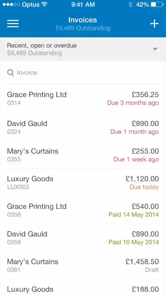
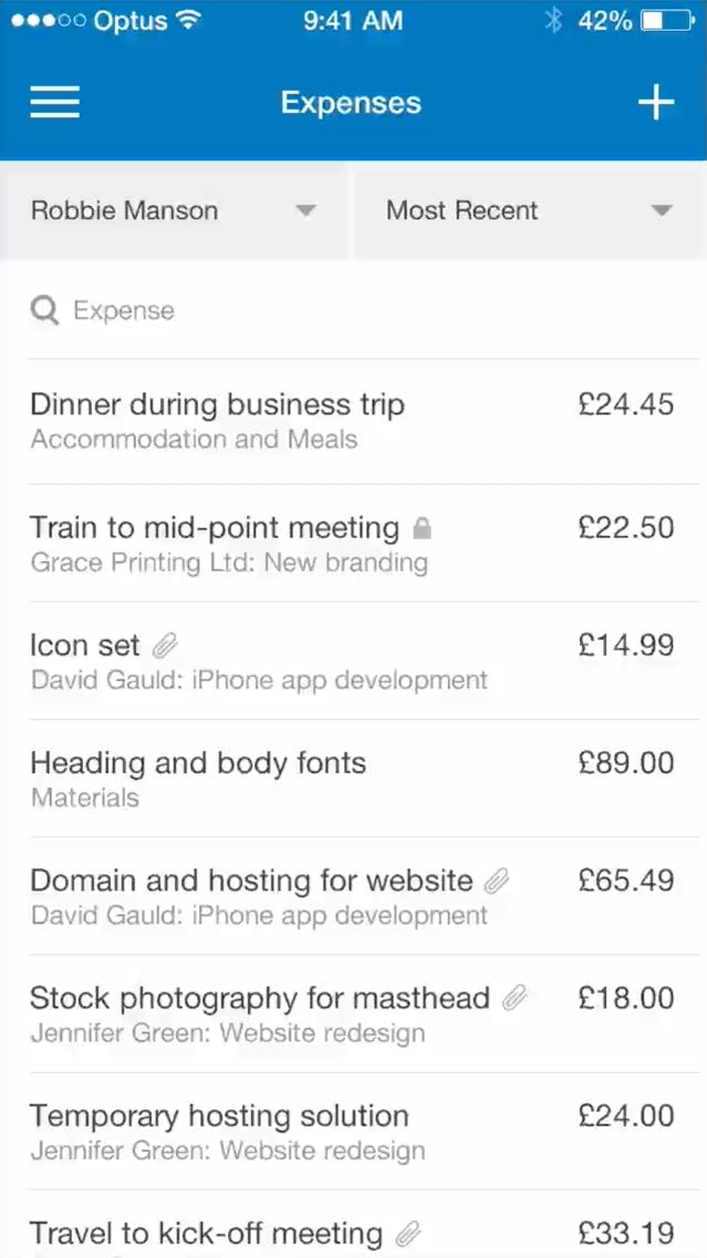
I chose to focus on the core Expenses and Invoices sections first. When a new design pattern was showing promise, I’d try it out in different scenarios, with different data, or in different sections. If needed, I’d make a quick interaction prototype before returning to pen and paper or Sketch/Fireworks. As the library of patterns and conventions began to grow, the app began to take shape.
Here are a few timelapses from specific sections of the app, stitched together from static mockups and prototype videos:
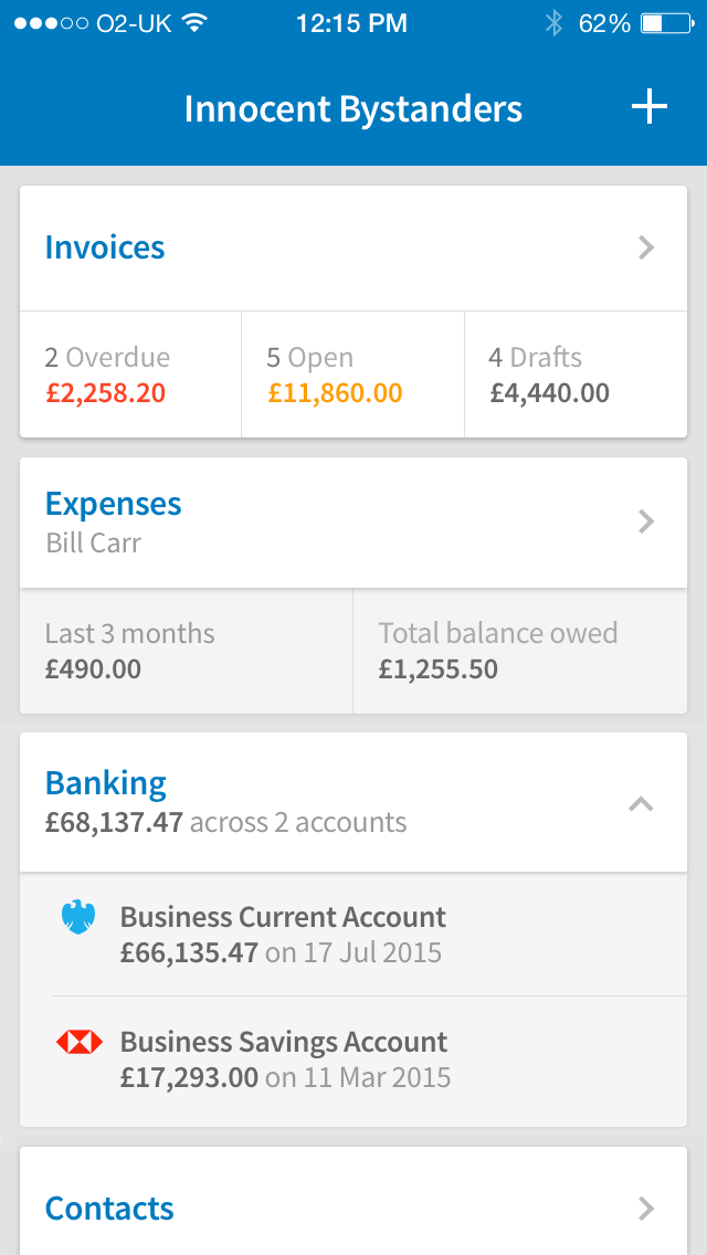
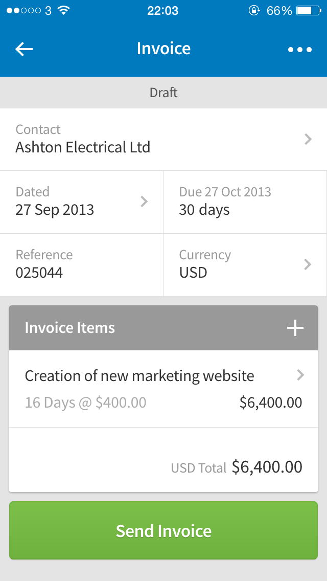
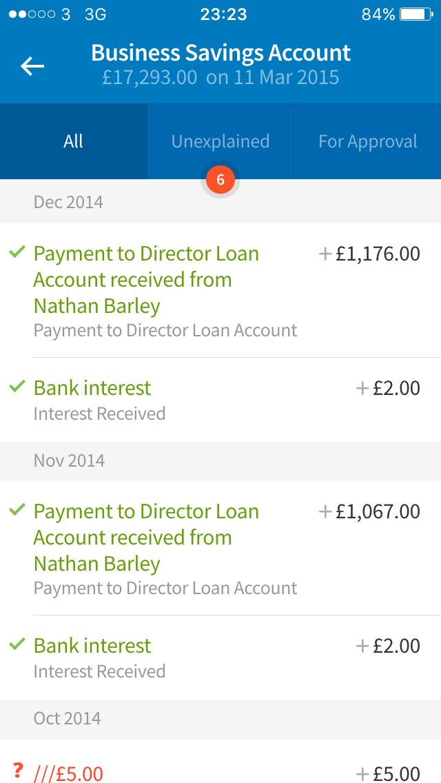
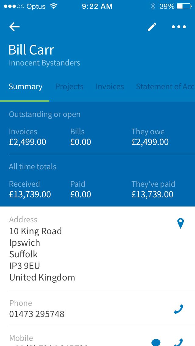
Whenever pen and paper sketches had proven some value in an idea or approach, and I’d worked things up into more detail using Sketch or Fireworks, I’d create quick prototype workflows in InVision to gain a better idea of how things actually felt in use. If I wanted create better connections between start and finish states or seemingly disparate elements within views, I’d do so using Framer and/or Proto.io.
Proto.io was the fastest way I found to test a simple interaction inside a single mockup. If the question was “Would this interaction even make sense?”, I’d jump into Proto.io. If the interaction passed this test, or if I already knew an interaction would make sense, I’d move into Framer.
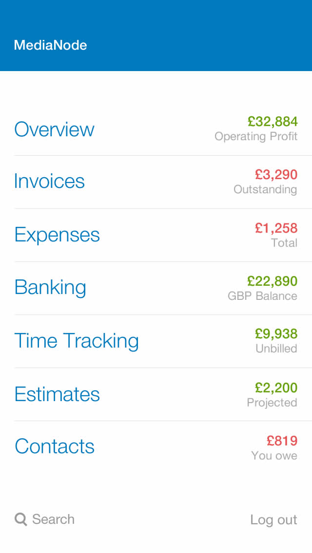
Prototyping in Framer meant I could precisely define the pacing and detail of animations and interactions. At this stage I wasn’t yet sure which elements of the app would be built using web technologies and which would be native, so I was just trying to create the best possible experience without worrying too much (yet) about implementation.
Had I known we’d eventually launch with 100% of the UI being built using HTML, CSS and JS, I wouldn’t have spent quite as long finessing spring animations — there was no way we knew of to use spring animations in CSS at the time of launch. We settled on using CSS for animations because the right amount of cubic-bezier curve tweaking rendered a good approximation, we could easily hardware accelerate CSS animations without any other dependencies, and CSS animation meant a lower learning curve for future team members coming on board.
A few videos of Framer prototypes I built:

A few key things that happened during the design process
From the start I’d been trying to distill multiple workflow steps into single views to keep the flows focussed: adding invoice items without leaving the invoice; filtering list views by date and year inside dropdowns; expanding out child list items from inside their parent. But getting the prototypes into people’s hands revealed that so many interactions in a small space was too involved, and often confusing.
I found that breaking the workflows out across multiple views was actually much more satisfying for people. As long as each interaction reinforced the idea that they were edging closer to their goal, more views with less interactions gave people more focus than a single view with many.
We really reduced the scope of the Contacts section to ship the first release quicker. It was an unfortunate trade-off, but the right decision. The original version had three distinct views: create, read, and edit. We launched with what was essentially just the edit form.
Displaying a contact’s details within the form itself didn’t perform as well in testing, but got the job done, and the original version is something we can build out in the future.
View the UI flow of the original version
View the UI flow of the simplified version
Heads up: these links will open a couple of large (~1MB) images.
We’d used Helvetica as the primary typeface in our products for years. It was the default choice as I was working through the early mobile app ideas, and remained in place until fairly late on. But as I began testing with wildly different data sets, it became clear that Helvetica wasn’t going to allow us to provide a large text size and prevent too many items from being truncated. It just wasn’t the right face for displaying the huge variance in our customers’ data on small screen devices.
When I happened upon Source Sans Pro and tried it in the app, the difference was dramatic. Its letterforms were more condensed and had a taller x-height, so we could fit the same amount of information into the same space as Helvetica, but at a significantly larger size.
While fleshing out ideas in Sketch and Fireworks I’d gradually transitioned away from greys into a palette close to that of our existing desktop app. But it just felt drab. A couple of years prior I’d created a more vibrant colour palette, but it was used primarily for communications design work and hadn’t impacted on our desktop app.
When I started implementing it here on mobile it really lifted the whole feel; the colours all took on that vibrancy and warmth but still felt recognisably ‘FreeAgent’ in the wider app context. Since the release of the app we’ve started working the same palette into other UI work.
The full library of colours being used in production can be found in the Origin docs.
Making CSS work well at scale is hard, and I have many regrets about the way I’ve built things over the years at FreeAgent. The months I spent building out the prototypes for FreeAgent Mobile allowed me to define a better way for all of our development teams to write HTML & CSS: a component-based approach that focussed on keeping our code and associated design patterns modular and reusable.
It was after reading Nicolas Gallagher’s About HTML semantics and front-end architecture and studying SUIT CSS that I became convinced a similar approach would be right for us. I documented all of the interface elements in my mockups according to a rough atoms/molecules/organisms structure (hat tip Brad Frost), and this helped form a clear plan for the first few components.
I created two open-source projects as a result of the mobile CSS work:
Our utility library is the one true source of CSS design properties at FreeAgent: scales and aliases, colours, mixins, and a universal method for using them across different projects. It’s not a standalone project, but a library to be implemented by other projects.
The utilities create a simpler and more meaningful way for designers and engineers to write CSS that always maps back to universal scales of values and aliases. Absolute values are abstracted away, which means less second-guessing the ‘right’ values to give properties at the same time as eliminating deviations from our house style (and therefore technical debt). Adding some structure and constraints means there’s less guesswork and therefore less mistakes to be made.
One of the projects that consumes the utilities is the internal CSS framework I created: Origin. Origin consumes the utilities and uses them to host the global UI components we use across our different applications. It’s still early days for Origin, but I’ve helped our various teams implement it into our desktop app, website, and a host of other projects. So there’s one consistent, scalable, predictable, and easier to maintain way of writing CSS. The versioning and serving of both Origin and FA CSS Utilities is controlled through GitHub and npm.
Implementing Origin in our projects has eased maintenance, increased code quality, improved the authoring experience, and helped us make sweeping changes with ease. All of which are enabling us to evolve our design language over time while shipping better work, quicker.
The development stack of the app includes React, which handles the UI rendering and user input. We use a few Backbone models to communicate with our API and implement some domain logic, and everything is packaged up natively using Cordova. We set out to build the UI using only HTML, CSS, and JS. That’s exactly how it ended up — but not without some false starts along the way.
Fixing our navbar component to the viewport using `position: fixed` performed poorly in mobile browsers when the view was being scrolled, so we built it natively. But we later found a method (using the Sass `calc` function) of subtracting the height of the navbar from the height of the scrolling content area, meaning we could do away with the native code.
View transitions are an essential element of most native apps, and smooth transition performance is key to giving hybrid apps a native feel. We laboured (and continue to labour) over these. While investigating performance we found that Safari on iOS actually does a good job of dealing with animations compared to Chrome on Android. Part of the Android release will involve refactoring animations to get up to 60fps, as inspecting transitions frame-by-frame has revealed lots of repaints being triggered.
Considering its relatively small feature set, the app has been really well received since launching in April. The number of downloads have far surpassed our targets, and at the time of writing (November 2015) just under 10% of our customer base are now using the app.
The 4-star rating we held for the first few months dipped to 3.5 while we were developing the crucial banking functionality. Since shipping the banking update—giving customers the ability to reconcile/explain transactions—we’ve seen regular 4 and 5-star ratings appearing again.
I’d love to have had the Android app out by now. As previously mentioned, there are a number of performance improvements to be made before a beta release can go out, specifically around the poor performance of transitions in Chrome. But we’re confident it’s not too far off.
What did I miss? Let me know and I’ll happily add more details.
Read another case study